Bringing humanity to brands of all shapes and sizes
As we’ve covered pretty recently, illustration has been having something of a moment in design. Showing up in what feels like every “Next Year’s Trends to Watch” design listicle since, like, 2017, illustrative branding has been steadily on the rise across disciplines, appearing not only in more traditional executions like print advertising but also on packaging, menus, TV spots – even as core components to branding identities – and, perhaps least expectedly, in the pixelated worlds of social media, web and digital interfaces.
How illustrative branding took over the web
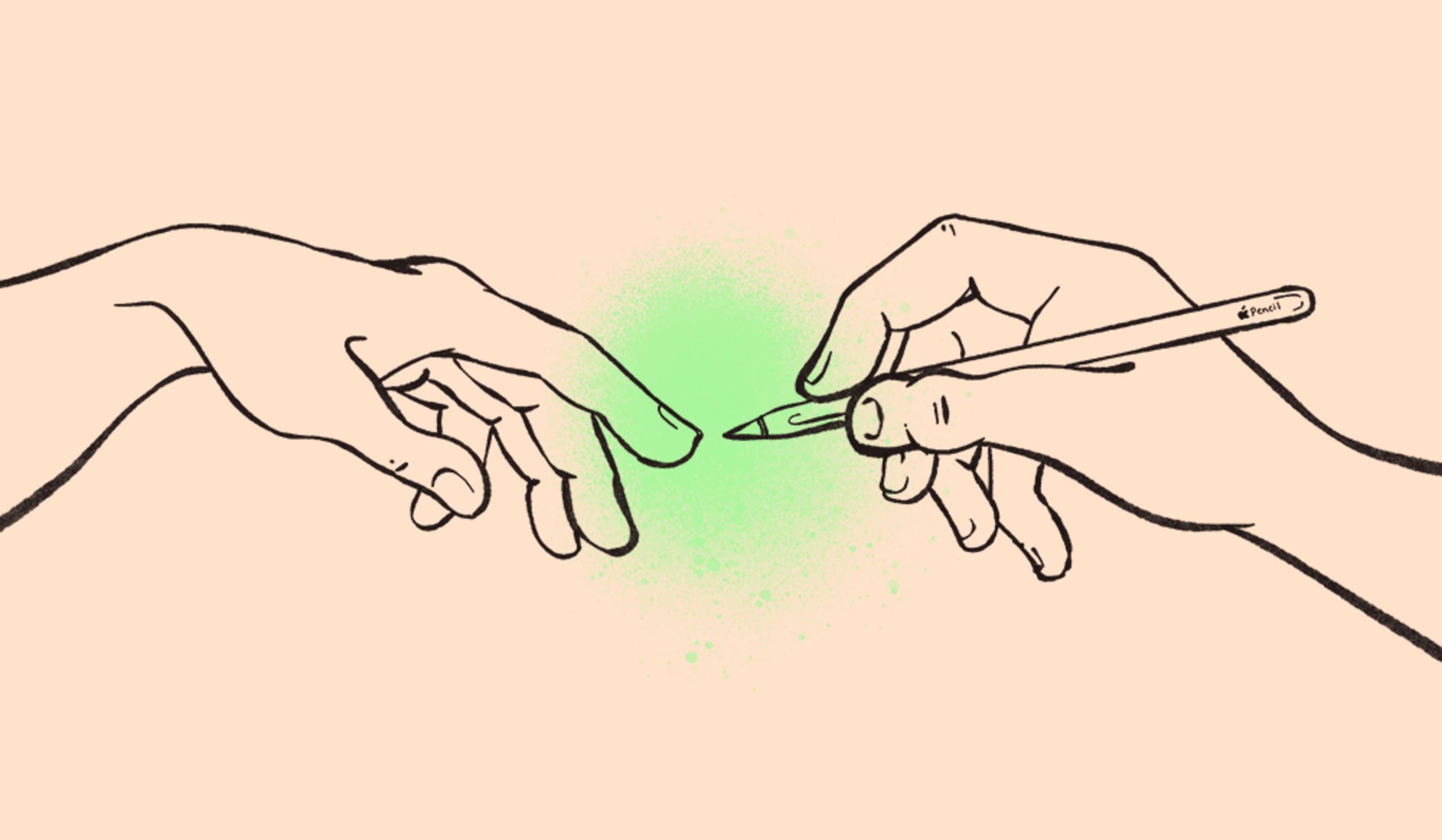
Digital illustration actually serves as a nice microcosm of the growing significance of illustration across creative industries. After half a decade of flat design ruling the internet, we started to see something new emerging in the margins of digital experiences – organic, hand-drawn, doodle-esque illustrations. This wasn’t just to be cute (though that was totally part of it), these drawings were adapted across digital platforms as powerful communication tools. The human brain understands and interprets visual information in a fraction of the time it takes to digest written information, and those visuals tend to stick to memory a lot longer, which is an invaluable aid in quickly and effectively explaining a product or brand while also endearing your brand and increasing recognition in your audience.
Moreover, illustration communicates a certain quality – humanity – that web and digital had been missing in the pursuit of ever-more simplified, streamlined, sanitized interfaces. For businesses where customers never speak to or interact with a real human being, it’s vitally important to tap into those gooey cognitive mechanisms that tell them a brand is a friend, made up of real folk, trustworthy. You know, someone you’d trust with your credit card info and all the files on your devices? Like Dropbox, a famous example and harbinger of the trend. Its quirky, actually hand-drawn illustrations started life out in the confines of emails and blogs but (after much positive reception) made their way throughout the product itself, even (and most important) the more unpleasant stops on the user journey, like error pages and the ever-awkward plan cancellation process. Simple and often silly drawings added levity and relatability to often frustrating experiences, as well as a sense of humanity in a totally digital interaction. Other tech companies took notice and started following suit, and digital illustration started popping up anywhere a little humanity was needed across the web. Today, you can find illustration’s influence anywhere and everywhere, from the colorful abstract blob people of YouTube and Facebook (more on that in a minute) to Slack to meditation apps like Calm and Headspace (to recuperate from the long days spent on Slack and Facebook). I’ll probably spend the rest of my life chasing the high that follows that sweet cartoon monkey hi-five when you successfully launch a Mailchimp campaign.
How illustration took over everything
So, illustration was already proving itself and its role in the digital space, and then a pandemic happened. There’s definitely something to be said purely on the sudden necessity of illustration where photo content would have typically gone in the time of COVID. In a year when traditional content production affairs with multiple in-person contributors became dangerous or even impossible, many art directors turned to illustrators (or turned into illustrators) to fill the gaps. However, the sharp rise of illustration in branding in the last year and a half goes beyond simply solving a logistical need. The same sterile virtual customer service obstacles that tech and online-only companies had been grappling with suddenly applied to every type of business, IRL or not. How could you instill a sense of warmth and human connection with your customers when you couldn’t even smile at them through a mask? How could your brand evoke safety and stability in a time of unmitigated, seemingly endless uncertainty? The same way a doodled smile and shrug helped soften the blow of a 404 error page, illustration rose to the occasion to communicate to audiences with a sense of whimsy and softness during a decidedly un-soft time.
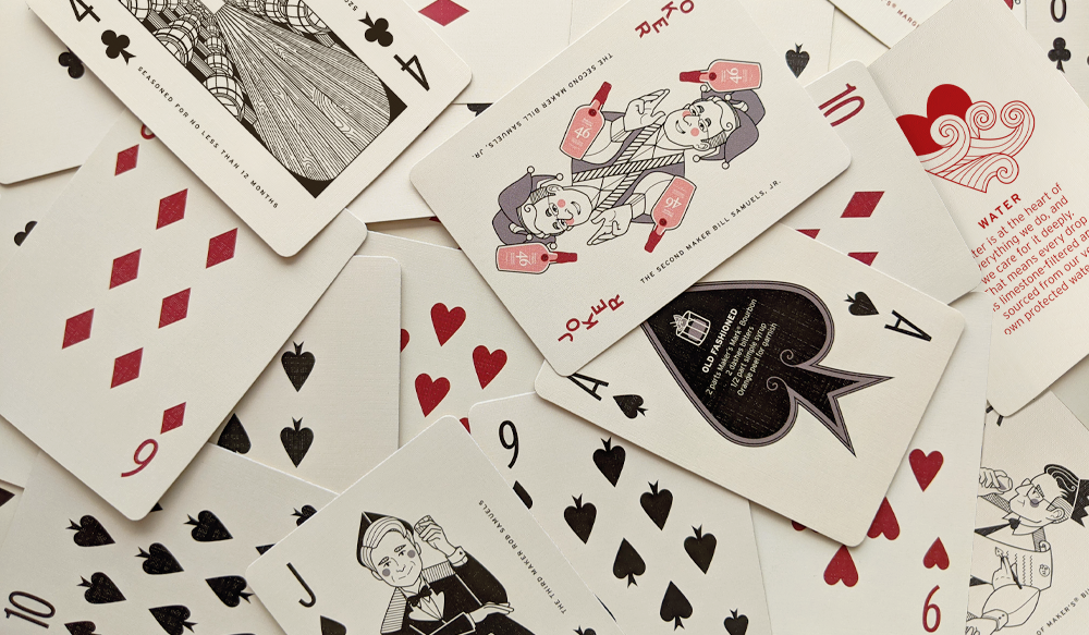
In 2020, for its annual holiday gift to brand ambassadors, Maker’s Mark chose an illustrated deck of cards—something tangible that inherently invited group participation. The smiling caricatures of the Samuels family throughout the deck served as a reminder of the human, family story behind the brand and helped fans feel as though they were among friends for the holidays, even if the game was solitaire.
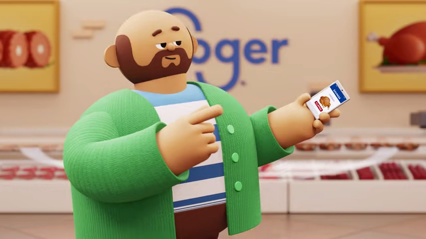
Kroger’s rebrand in late 2019 couldn’t have been more timely: a redesigned, rounded sans serif logo and brighter color palette accompanied a suite of delightful 3D, illustrated characters (lovingly dubbed “Krojis,” a portmanteau of “Kroger” and “emoji”). The original intention of the Krojis was to give Kroger customers and employees a way to see themselves more literally in communications, saccharine abstractions of the ideas of friends, family and community that people could project themselves onto, however, the new look rolled out in stores just in time to help offset the cold dystopian misery of masking, social distancing and plexiglass between customers and cashiers.
Grubhub went for a similar play in their now infamous “Delivery Dance” animated spot. It made perfect sense – Grubhub was and still is a human-centered service, but the pandemic and no-contact delivery eliminated the part of the exchange where we say hello or thank you or even make eye contact with the person bringing us our food. Colorful noodle people dancing with their takeout should have landed, but the ad was almost universally despised and lambasted by the internet at large, launching months of spoofs and memes mocking the soulless corporate style that it came to represent.
The generally positive reception of Kroger’s illustrations early in 2020 compared with the overwhelmingly negative response “Delivery Dance” garnered later in the same year highlights an important takeaway when considering the power of illustration as a trend and determining if it’s right for your brand. Illustration’s popularity is at an all-time high and doesn’t appear to be going anywhere, but it’s not an easy, one-size shortcut for brand humanization. As the visual market becomes more and more saturated, consumers are wising up and becoming aware of brands’ half-hearted attempts to make themselves relatable.
People can totally tell if you’re faking it
The public’s general malaise with this certain flavor of illustration is becoming so apparent, it earned itself a name – “Corporate Memphis.” Even if you don’t recognize the name or haven’t read one of the dozens of other think pieces decrying Corporate Memphis, you almost definitely recognize the look: smiling, amorphous, abstract blob people, often with purple or blue skin, wild proportions with tiny heads and massive lanky limbs, always having more fun than you. Facebook’s house style, dubbed “Alegria,” is maybe the most emblematic example, but you’ll notice it absolutely everywhere once you start looking for it. The reason this look is so widespread – the reason brands keep falling back on it – is the same reason audiences are growing disenchanted: It’s too easy. On the brands’ parts, at least on paper, it’s fun, engaging, organic – all the things I said made digital illustration successful a few paragraphs back. It also has the benefit of being very simple to replicate and standardize and is fast and inexpensive to produce. You don’t even need an illustrator in some cases – services like Blush offer a whole library of customizable stock assets from a variety of illustrators at the click of a mouse. However, the look’s accessibility is its downfall. When everyone is taking advantage of illustration, it’s a lot harder for your brand’s specific flavor of innocuous corporate art to stand out.
How to successfully implement illustration in branding
So what’s the solution? Stop being so innocuous. The reason Dropbox’s illustrations broke through the noise a decade ago wasn’t because they were nice, pretty pictures (though again, definitely part of it), it’s because they did something honest, inexpressively real, human. They pulled back the digital curtain and revealed the human beings at work behind the product. While the aesthetics of organic, hand-drawn designs are easy to replicate, the authenticity needed to bring them to life is harder to capture. While illustration is a trend now, it’s an ancient practice. And the thing cave paintings and today’s successful illustrations have in common is they don’t exist simply as decorative fluff or filigree, but as essential pillars of the communication. It’s not enough to talk – you need to say something. And if your brand has nothing to say, it might be better to just stay out of the conversation. Maybe the future of communicating authentically through illustration is less in the execution and more in the intent, less in creating a pixel-perfect piece and more in tapping into the primal simplicity of initials carved into a tree stump or a phallus scrawled in the margins of a history textbook. Remind them that this ad was brought to you by a human being: I was here. I’m alive. And I’m talking to you.
Interested in learning more about illustrative branding or talking about how illustration may work for your brand? Get in touch!
)
)