Over the last decade, the web has been a change agent for corporate identities. Responsive design and social media have forced brands to expand their visual experiences. Web icons, secondary typography and photography – even logos redressed to fit a circle or a square – were produced to stay current.
As the Internet of things tethers us beyond our phones and tablets, brands will have an opportunity to express themselves more dynamically than ever before. For instance, tap your refrigerator door and a G.E. logo scales up before transitioning to reveal a tailored message for you. “Good morning, Jane,” perhaps. It’s a hypothetical example, but the technology (soon to be ubiquitous) will force brands to evolve visually. And motion design will likely be a tool that brands use to stay current.
Research on perceived increases in brand sophistication after animated logo viewing found "If we think that a logo is alive or that a brand is alive, it’s easy for us to give it a personality.” Many of the world’s largest companies are already redesigning and planning new ways for their brands’ identities to grow. Creating things like animated logos, graphics for video intros and gestural movements for apps and websites helps tell brand stories in this expanded digital space.
Rebranding efforts by Mastercard and Google are case studies in motion design implementation within a brand identity. During their redesigns, both companies considered their marks statically and animated, asking what could be communicated through motion that static designs couldn’t convey. Pentagram, the firm tasked with the Mastercard rebrand, explained –
“Digital technology is a growing segment of Mastercard’s business, and it needed an identity that would help position the brand as a forward-thinking, people-centered technology company. The new mark is designed to work seamlessly across all digital platforms, retail channels and connected devices.”
Google’s design case study highlights premeditated uses for the animated logo – “The Google dots are a dynamic and perpetually moving state of the logo. They represent Google’s intelligence at work and indicate when Google is working for you. We consider these unique, magic moments. A full range of expressions were developed including listening, thinking, replying, incomprehension, and confirmation.”
It doesn’t end with the logo. Media companies rooted in television have long implemented the brand ident – a 5- to 30-second video of animated brand colors, textures and supporting art meant to establish brand recognition as viewers surf through channels. Take a look at this one from MTV:
Shorter forms of the ident have transferred from television to YouTube and social media videos. Scrolling through Facebook, it’s hard to pass over the hard-cutting copy in Vice videos. On Facebook, Vans® packages new products differently than other video content it produces, and the videos are eye-catching, to say the least.
 Vans ident.
Target® defined a distinct motion graphic treatment to show off its new merchandise. Like Vans’ ident, the treatment is consistent with, but differs from the rest of Target’s video content. Unique packaging creates a memorable pattern more likely to engage users.
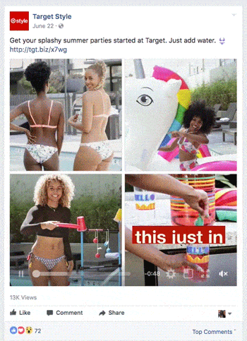 Facebook Ad by Target.
While working on a video ad for social media, an art director asked me if we normally animated messages a certain way. We did indeed, but it wasn’t something ever documented in the brand guide. When it comes to brand identities, designers label everything related to the brand expression. With video content cranking at a record clip, it makes sense to consider how motion can accentuate the brand, lest an inconsistent animation style arise for content from TV to social.
So, it’s time to think about how this emerging, hyper-connected world of phone screens and displays fits within your brand’s goals. Motion design is developing as a practical way to set your brand apart – from the way Mastercard reinforces its luxurious look to Google’s use of animation to be playful, to notify, or even to mesmerize. If color, logos and typography are items used to build the face of a brand, then animation can stretch the muscles far enough to form a smile – or frown, if that’s on brand.
)
)